Industry
Endurance Sports
Client
TrainingPeaks
Onboarding Email Campaign
Designing a Comprehensive User Onboarding Experience — Streamlining engagement and driving premium upgrades for TrainingPeaks
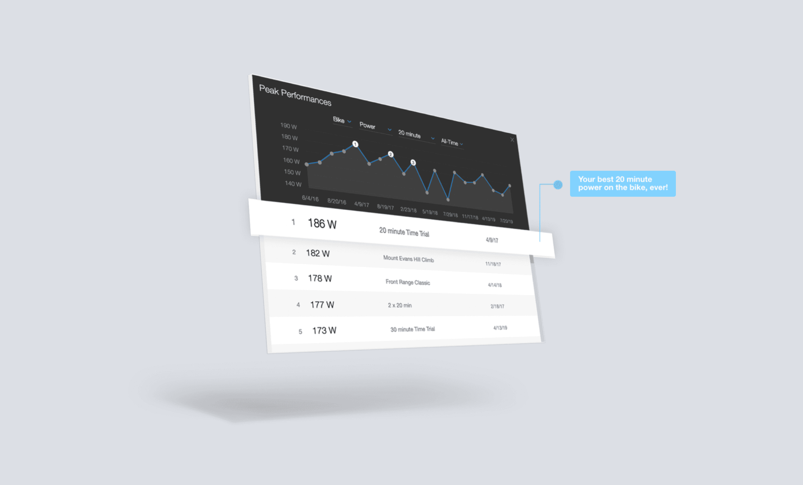
TrainingPeaks is a powerful platform for athletes, offering tools for structured training and progress tracking. A new onboarding campaign was crafted to guide new users through the platform, simplifying their journey and encouraging long-term success with deliberate practice and premium features.
My Role
UI Design
Deliverables
Development-ready Designs
Platform
Email
Project Overview
As part of a cross-functional team at TrainingPeaks, I was tasked with designing an email onboarding campaign aimed at helping new users get the most out of the platform. The TrainingPeaks app is a powerful yet complex tool that assists athletes in tracking their fitness, analyzing their performance, and reaching their goals through deliberate practice. However, many new users are unsure of how to navigate the platform when first starting out. Our goal was to create a series of emails that introduced users to the key features, provided valuable guidance, and encouraged them to engage with the platform more effectively.
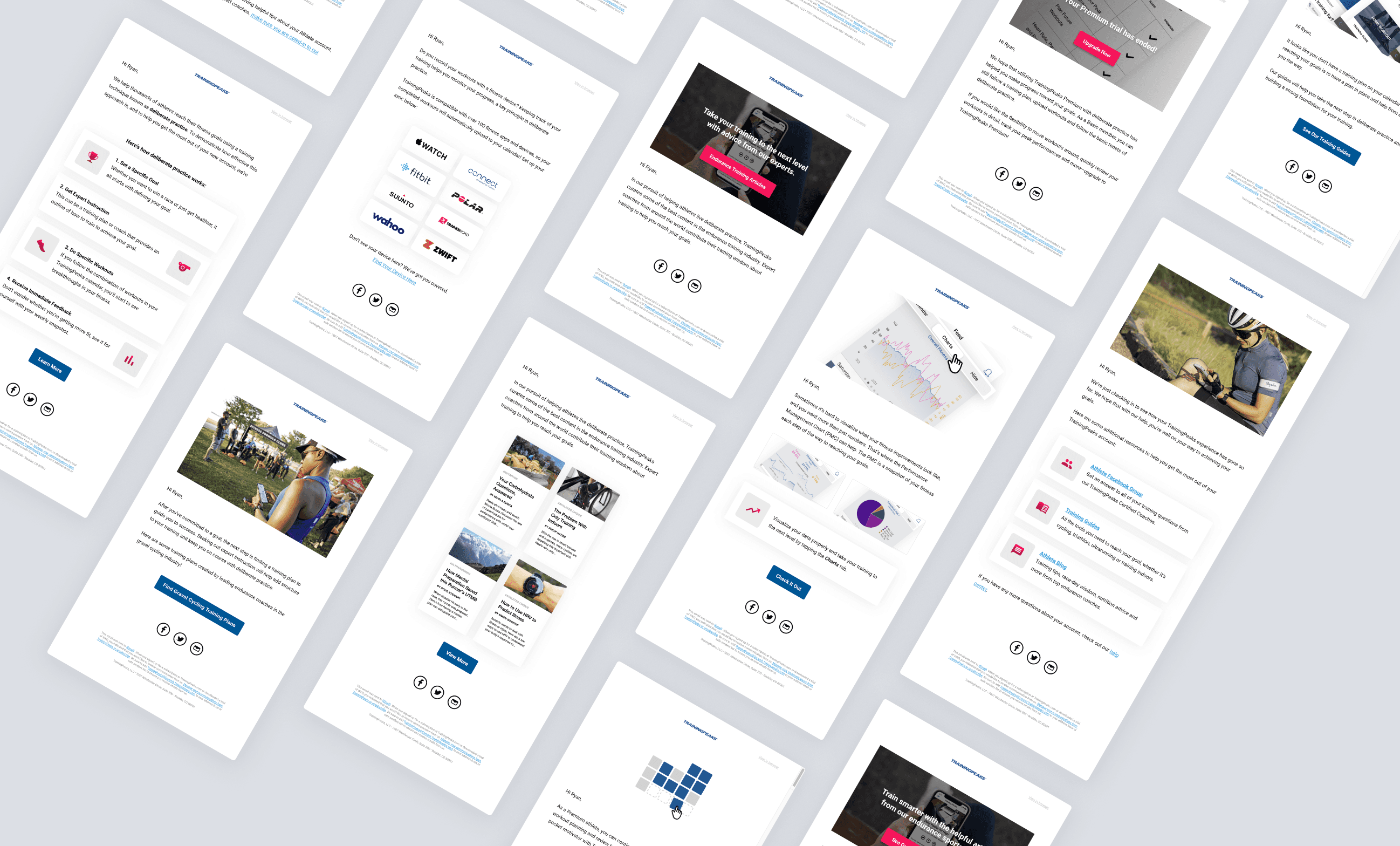
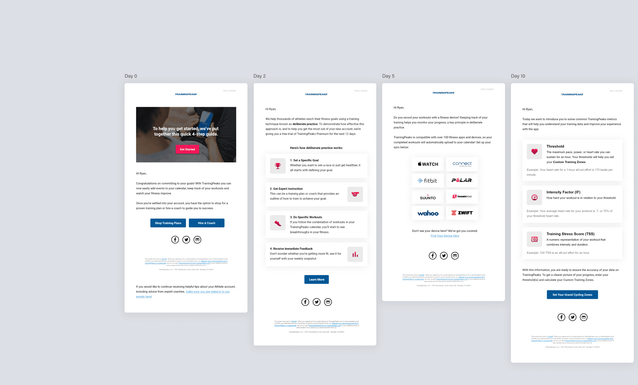
The onboarding email series was designed to be sent at specific intervals over a 30-day period, guiding users step-by-step in exploring the platform, setting up their accounts, and utilizing TrainingPeaks to its full potential.
My Role
As the UI Designer on this project, I collaborated closely with the project lead, a copywriter, and a member of the marketing team to develop a series of emails that aligned with the company’s branding and user interface. I designed these emails using the TrainingPeaks UI kit to ensure consistency in visual design across all touchpoints. Throughout several iterations, I balanced the need for visual appeal with clear, actionable content that would enhance the user’s experience.
Challenges
Complexity of the Platform: TrainingPeaks offers a wide range of tools and features, which can be overwhelming for new users. We needed to break down this complexity into digestible steps.
Maintaining Engagement: With a 30-day email series, ensuring users remained engaged with the content and the platform throughout was a priority.
Tailoring Content: Users come to TrainingPeaks with varied goals and fitness levels, so the email series had to cater to both beginner and advanced athletes.
Process
Research & Discovery: We began by analyzing user pain points and reviewing feedback from new TrainingPeaks users to understand their challenges when first interacting with the platform. This helped inform the structure of the email series and the content focus for each message.
Content Structure: Working closely with the copywriter, I helped map out the sequence of emails, focusing on:
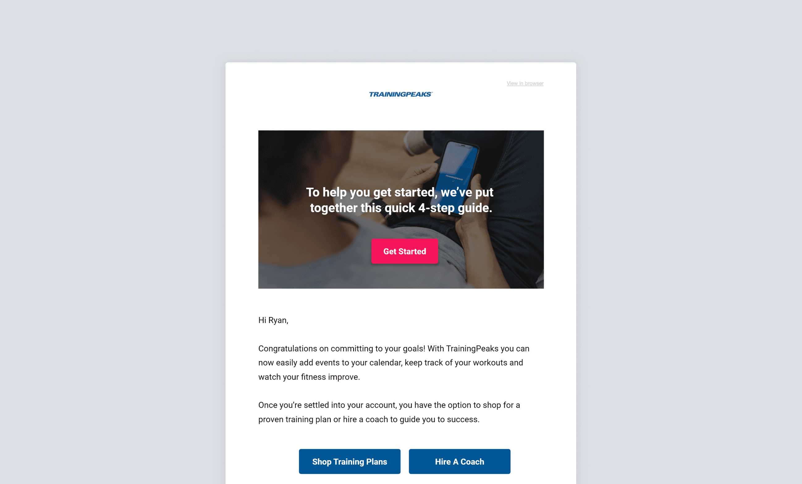
Immediate welcome and account setup guidance (Day 0)
Introduction to deliberate practice and a 12-day free trial of Premium features (Day 2)
Instructions on connecting fitness devices and uploading workouts (Day 5)
Deep dives into metrics and expert resources for improving performance (Day 10)
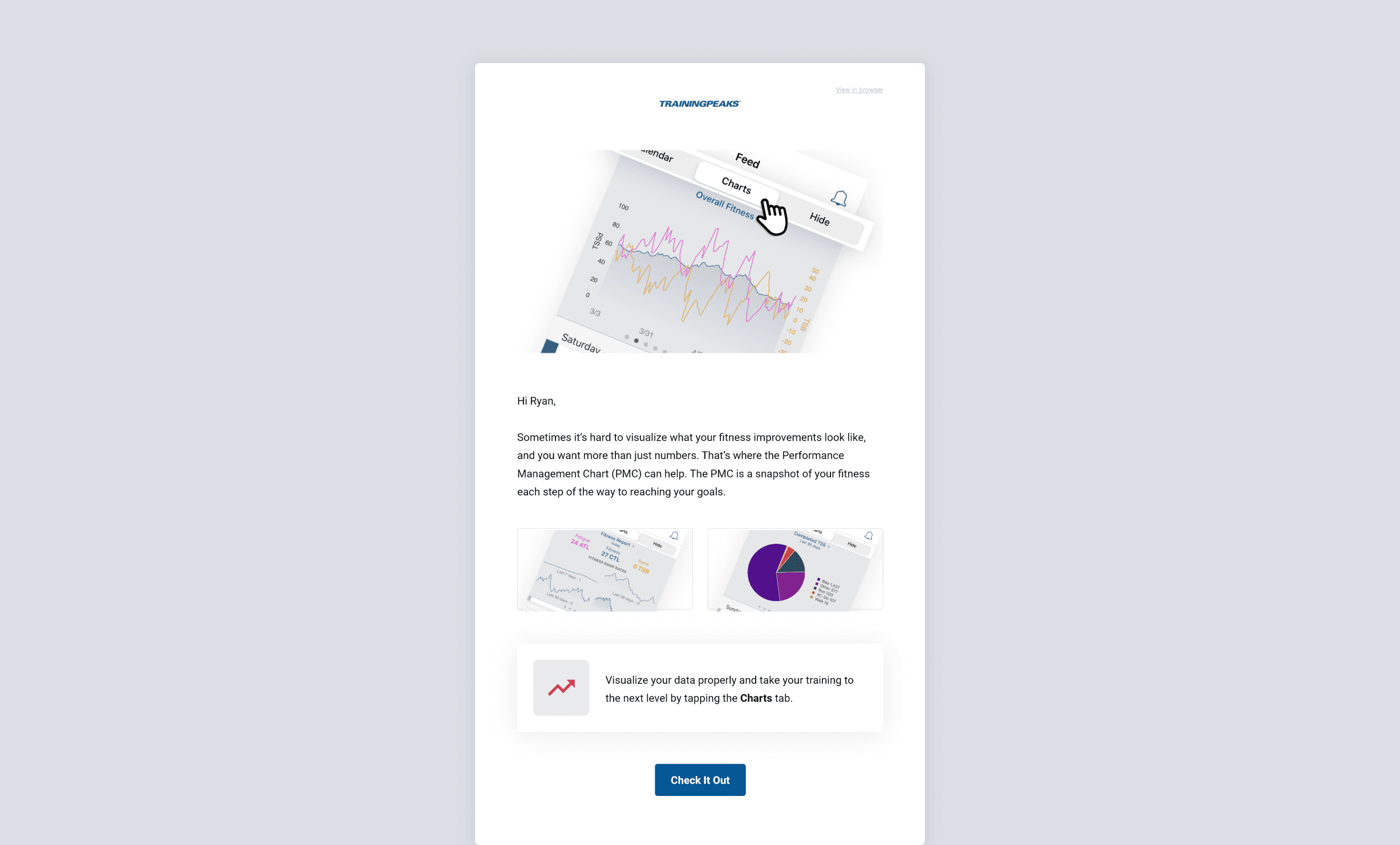
Upsell opportunities for TrainingPeaks Premium (Day 15)
Blog content and additional resources for continued engagement (Day 30)
Design & Iteration: Using Adobe XD, Photoshop, and Illustrator, I developed wireframes and visual mockups for each email. The design language remained consistent with TrainingPeaks’ brand, emphasizing clean, user-friendly layouts with clear calls to action. I ensured that each email was responsive and mobile-friendly, given the prevalence of mobile use among our target audience.
Collaboration & Feedback: Throughout the project, I worked iteratively with the team, receiving feedback from marketing and the project lead to refine the emails. We conducted several rounds of revisions, focusing on copy adjustments, visual hierarchy, and user engagement metrics to ensure the emails were effective.
Outcome
The email series was successfully launched, providing new users with a clear, step-by-step introduction to the TrainingPeaks platform. Some of the key results included:
Increased Engagement: By breaking down complex features into manageable steps, we saw an uptick in user engagement with key features such as device integration and workout uploads.
Higher Premium Conversions: The upsell emails targeting users at the end of their free trial resulted in a higher conversion rate for TrainingPeaks Premium subscriptions.
Positive User Feedback: Users reported feeling more confident in navigating the platform, and there was an increase in the number of athletes who connected their fitness devices and applied training plans early in their journey.
Tools & Technologies
Adobe XD for wireframing and prototyping.
TrainingPeaks UI Kit to maintain brand consistency.
Key Learnings
Effective Onboarding Drives Retention: A well-designed onboarding experience can dramatically increase user engagement and retention, especially in complex platforms like TrainingPeaks.
Collaboration Across Teams Is Essential: Working closely with copywriters and marketing allowed us to align the product design with the messaging strategy, creating a cohesive user experience.
Personalization and Timely Guidance Matter: Users responded well to emails that were tailored to their actions (e.g., whether or not they had connected a device or applied a training plan), reinforcing the importance of personalized communication in onboarding.

