Industry
Youth Sports Software
Client
TeamSnap
TeamSnap Return to Play: Reigniting Youth Sports Participation
Reviving the Passion for Youth Sports — Designing a Microsite to Drive Return to Play Momentum During COVID-19 Recovery
When COVID-19 disrupted youth sports participation, TeamSnap needed to reignite enthusiasm and build confidence in returning to play. As a leading sports management platform empowering coaches, parents, and athletes to organize and stay connected, TeamSnap turned to us to create a compelling microsite that would inspire their community and drive momentum for sports' return.
My Role
UI Design
Deliverables
Development-ready Designs
Platform
Web
The Challenge
The impact of COVID-19 on youth sports created a complex web of challenges that went far beyond just declining participation numbers. Research showed that 30% of kids had lost interest in returning to their primary sport – a startling statistic that threatened the future of youth athletics. This directly affected TeamSnap's core business, with active user numbers significantly lagging behind 2019 figures.
The business impact extended to the advertising side as well. With 70% of media buyers reporting uncertain spending plans for 2021, the traditional sponsorship revenue model was at risk. This created a delicate balance: the platform needed to provide value to sponsors while maintaining an authentic connection with users who were primarily concerned about their children's engagement with sports.
Adding to these challenges was intense timeline pressure. The microsite needed to launch in alignment with spring sports seasons and vaccination rollout schedules, creating a narrow window for development and implementation.
The Process
Discovery & Strategy
I began with a thorough analysis of the project requirements and stakeholder needs through extensive discussions with the TeamSnap team. It became clear early on that authenticity would be crucial to the project's success. While many companies were publishing corporate statements about returning to sports, TeamSnap wanted to take a more personal approach. By sharing real stories from their employees about what youth sports meant to them, they could create genuine emotional connections with their community.
Video content emerged as the natural medium for these stories. Not only would it allow for more impactful storytelling, but it would also showcase the diversity of experiences within the TeamSnap team. The challenge would be balancing this authentic content with the need to integrate sponsor messaging and ensure the solution could scale across different sports and age groups.
Technical Challenges
Early in the project, we identified several technical hurdles that would significantly impact the design approach. Video content would be central to the experience, requiring careful consideration of performance and user experience across different devices and connection speeds. Working closely with the development team, we created specifications for video delivery that would balance quality with load times.
Key technical considerations included:
Optimized video loading strategy to maintain performance
Responsive design requirements for various screen sizes
Integration points for sponsor content and analytics
Content management system requirements
Design Development
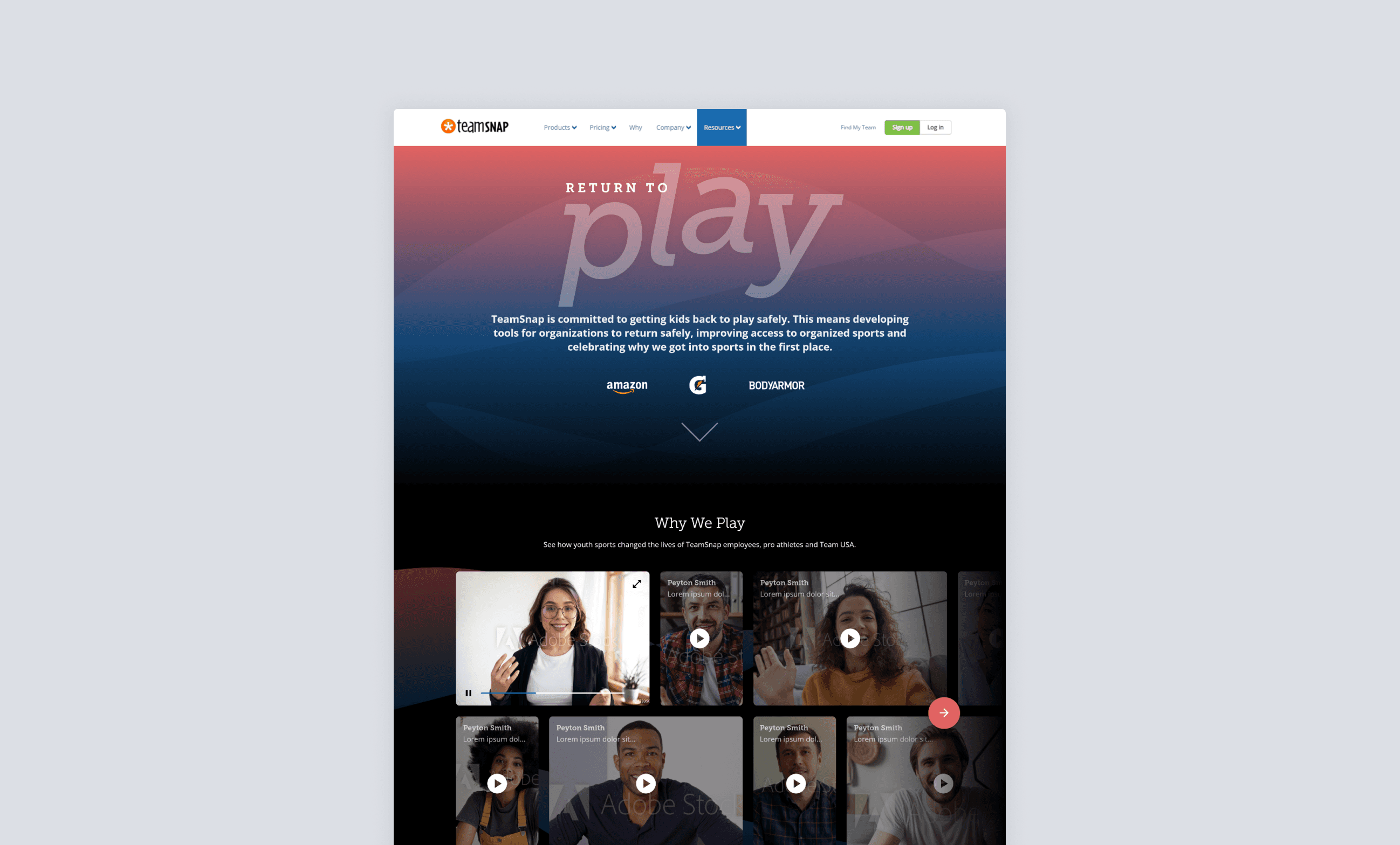
The design process unfolded in three main phases, each building on insights from stakeholder feedback and technical requirements. We began with the crucial above-the-fold experience, crafting a visually striking hero section that immediately communicated the Return to Play message while elegantly incorporating sponsor branding.
Video content presentation posed unique challenges. Through several iterations, we developed a grid layout that would showcase employee stories effectively while maintaining performance. The final design included:
Key Features:
Smart video loading to optimize performance
Mobile-first responsive grid
Clear pathways to related content
Seamlessly integrated sponsor sections
Each iteration was refined through stakeholder feedback and technical validation, ensuring the final design would meet both user needs and technical requirements.
Iterative Refinement
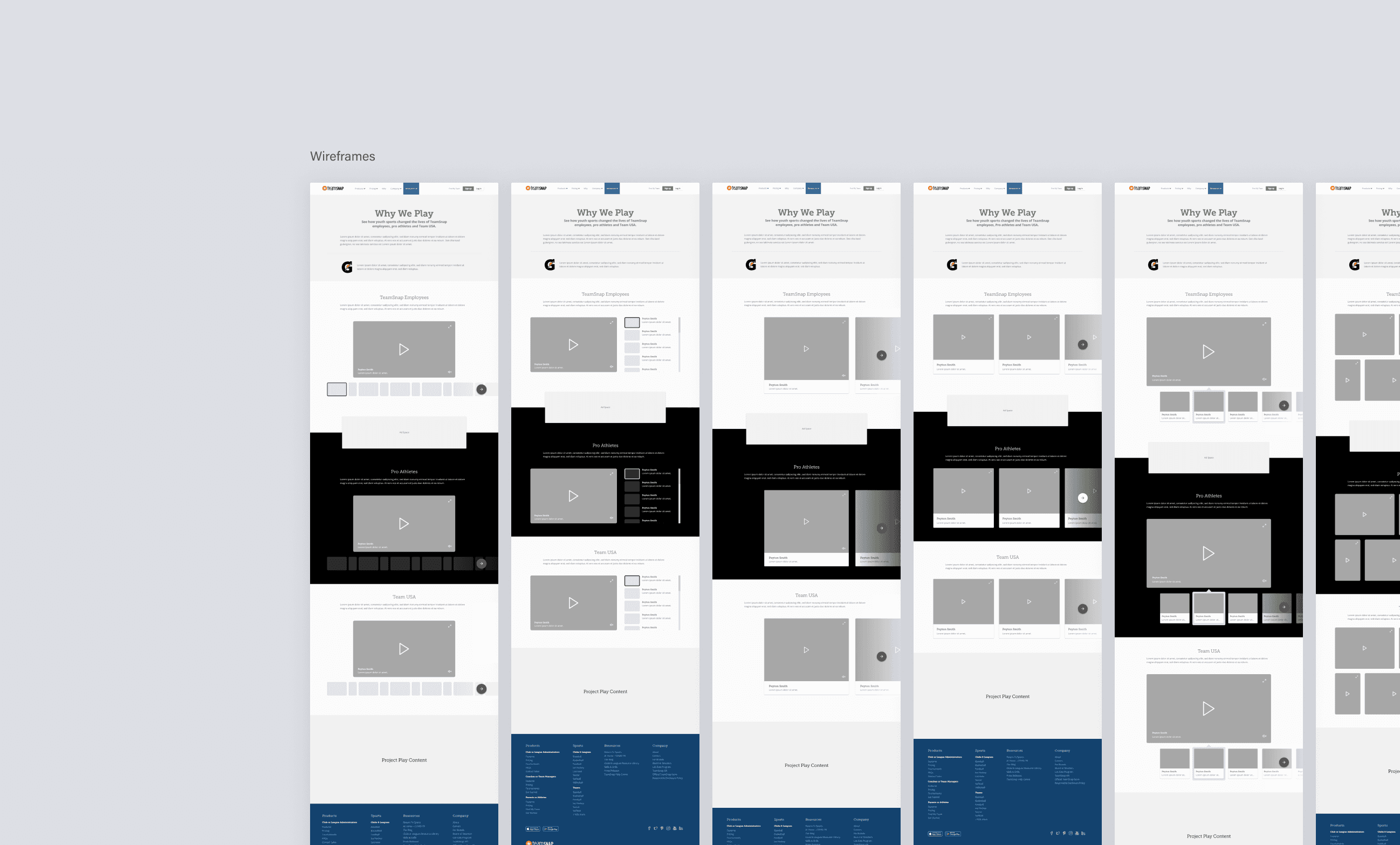
The design evolved through several phases:
Initial wireframes focusing on content hierarchy
High-fidelity mockups with stakeholder feedback
Interactive prototypes for user testing
Final development-ready designs
The Solution
The final microsite delivered:
Content Strategy
Authentic employee video stories about youth sports impact
Clear messaging around return to play safety
Strategic sponsor integration points
User Experience
Intuitive navigation and content discovery
Optimized video playback
Mobile-first responsive design
Business Integration
Sponsor placement opportunities
Analytics tracking implementation
Scalable template for future campaigns
Impact
The microsite's successful launch in May 2021 marked a significant milestone in TeamSnap's COVID-19 recovery strategy. By creating a platform that balanced authentic storytelling with business needs, we helped TeamSnap reconnect with their community during a crucial transition period. The video-driven approach resonated strongly with users, while the thoughtfully integrated sponsor sections provided value without disrupting the core message.
Perhaps most importantly, the project established a robust foundation for future campaign initiatives. The design system and templates we developed could be readily adapted for new content and campaigns, giving TeamSnap the tools to maintain momentum as sports participation continued to recover. Stakeholder feedback was overwhelmingly positive, particularly regarding how the design maintained authenticity while meeting business objectives.
Looking Forward
This project reinforced the importance of balancing emotional storytelling with business objectives. By focusing on authentic experiences while considering technical constraints and stakeholder needs, we created a platform that helped TeamSnap support their community's return to youth sports.
The design system and templates developed set the foundation for future campaign microsites, allowing TeamSnap to build on this success as they continue supporting youth sports participation.


