Industry
Language Learning
Client
LingoAce
LingoAce: Scaling Global Education Through Design
Transforming an Online Learning Platform from Regional Success to Global Leader
When parents want their children to learn Mandarin Chinese, they need more than just a teaching platform - they need confidence in the educational experience they're choosing. LingoAce had built this trust in Southeast Asia through their exceptional curriculum, developed by a team of over 200 experts in China. But as they expanded globally, particularly into the U.S. market, their digital presence wasn't creating the same confidence among new audiences.
My Role
UX Design
UI Design
Deliverables
Development-ready Designs
Design System & Documentation
Platform
Web
The Challenge
Through initial research, we discovered that LingoAce's website wasn't just failing to build trust - it was actively creating confusion. The problems manifested in several critical ways:
Low Organic Growth: Heavy reliance on paid advertising with customer acquisition costs reaching $5,000 per user
Cultural Disconnect: Website content and imagery didn't resonate with US market
Trust Barriers: Essential information about teachers and methodology was buried
Complex User Journeys: Different markets required different levels of human interaction
Language Issues: Content translations often missed cultural context
"80% of US parents are really not comfortable answering phone calls from strangers... but our website doesn't give them another option." — Course Consultant
"They don't usually describe the experience very well, because they're always asking me questions about what they're seeing on the website versus what I'm telling them, which are often contrary. And so the feedback is that's not what it says on your website." — Course Consultant
My Role
As Senior Product Designer, I worked alongside another product designer for 6.5 months to transform LingoAce's digital presence. Our complementary skills and collaborative approach allowed us to tackle the complexity of designing for multiple markets while maintaining consistency across the platform.
The Process
Discovery & Research
To bridge the gap between LingoAce's success in Asia and their global ambitions, we needed to understand both the business reality and user perspectives. Through 23 stakeholder interviews and 24 in-depth customer interviews, a fascinating insight emerged: we weren't just designing for different markets, but for fundamentally different approaches to language learning:
Chinese Heritage Families:
Discovered LingoAce through WeChat and referrals
Comfortable with high-touch sales process
Research timeline: Few days to 4 months
"Because we have a Chinese background, both me and my husband were born and raised in China so we hope [our daughter] understands deeply about Chinese culture, history, and everything." — Chinese Heritage Parent
Non-Chinese Heritage Families:
Found platform through Google search and ads
Expected self-service options
Research timeline: 3-4 weeks average
"I think Mandarin is a great language to learn for his future, especially because Germany and China have strong partnerships and trade... So it would open up a lot of doors for him in his career." — Non-Heritage Parent
Design Sprint & Early Validation
Sensing misalignment between stakeholder expectations and user needs, we conducted a modified design sprint focusing on key opportunity areas:
Day 1: Research Synthesis
Mapped user journeys for different segments
Identified critical pain points
Generated "How Might We" questions
Created opportunity framework
Day 2: Solution Development
Explored multiple design directions
Created rapid prototypes
Tested key assumptions
Built consensus on direction
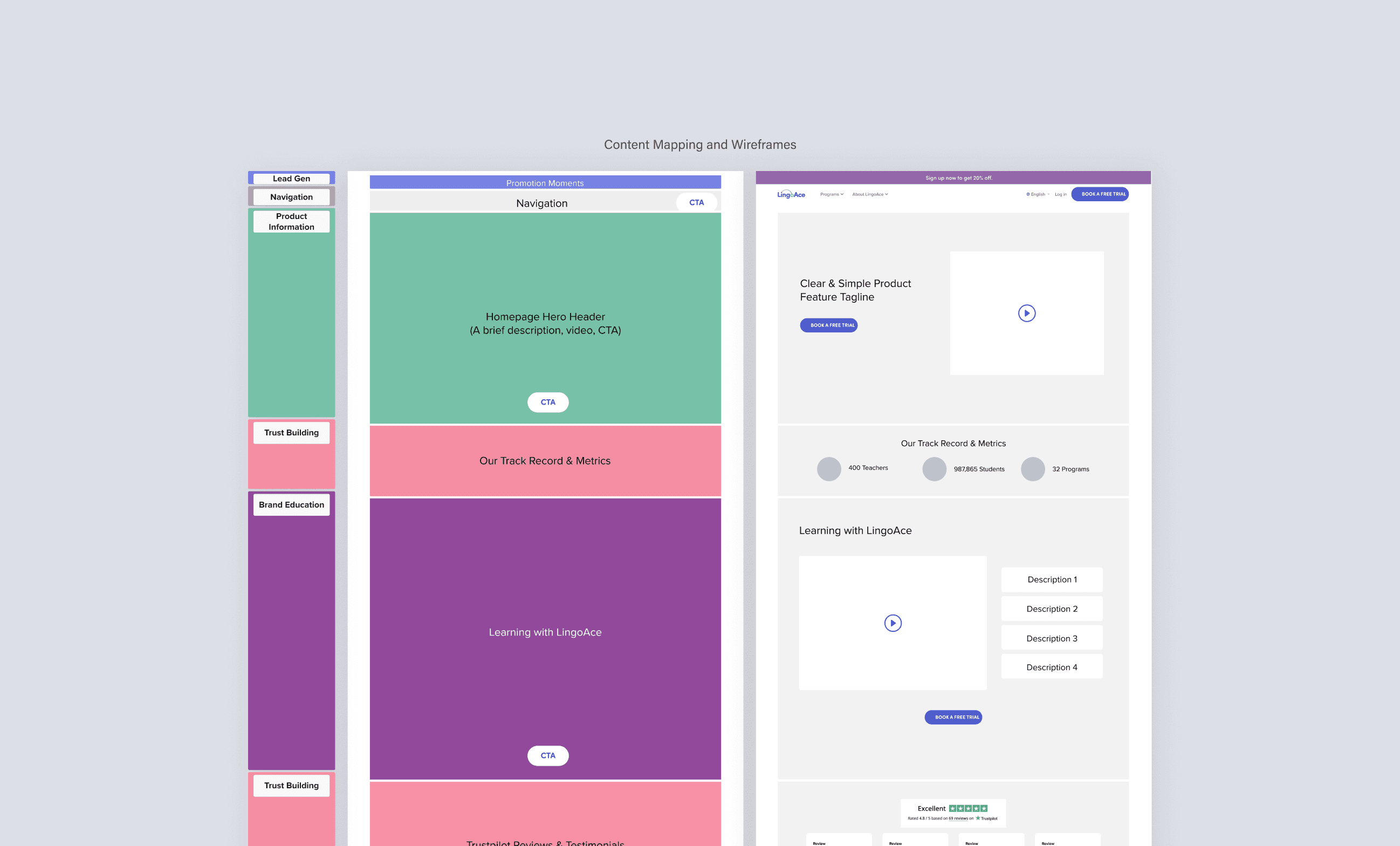
Information Architecture Deep Dive
With clear user segments identified, we needed to create a site structure that would serve both audiences effectively. We conducted two rounds of tree testing with 100 users to validate our approach. The results revealed crucial insights about user expectations:
Moving "Teaching Method" content proved crucial - 69% of users naturally looked for it under "Discover LingoAce"
Users consistently sought pricing across multiple sections
Navigation needed to support both high-touch and self-service journeys
"Parents think that we have programs for three year olds that have never learned Mandarin before. That's not the case and the website isn't real clear... I end up having to explain things differently from what they see." — Course Consultant
Iterative Design & Testing
With our information architecture validated, we moved into detailed design. Multiple rounds of usability testing with both heritage and non-heritage families helped us refine the experience around several key areas:
Teacher Profiles:
Users valued seeing teacher credentials and experience
Video introductions helped build confidence
Teaching style descriptions influenced decisions
"I think it's very important that they're letting you look at the teacher ahead of time... that transparency is there." — Usability Test Participant
Class Experience:
Parents wanted to understand curriculum structure
Interactive demos helped set expectations
Clear trial class process was crucial
"I would love to know what strategies they use and the scientific research to back up the strategies." — Parent Interview
Payment and Scheduling:
Clear pricing information needed upfront
Flexible scheduling options essential
Multiple payment methods required by region
Clear cancellation policies requested
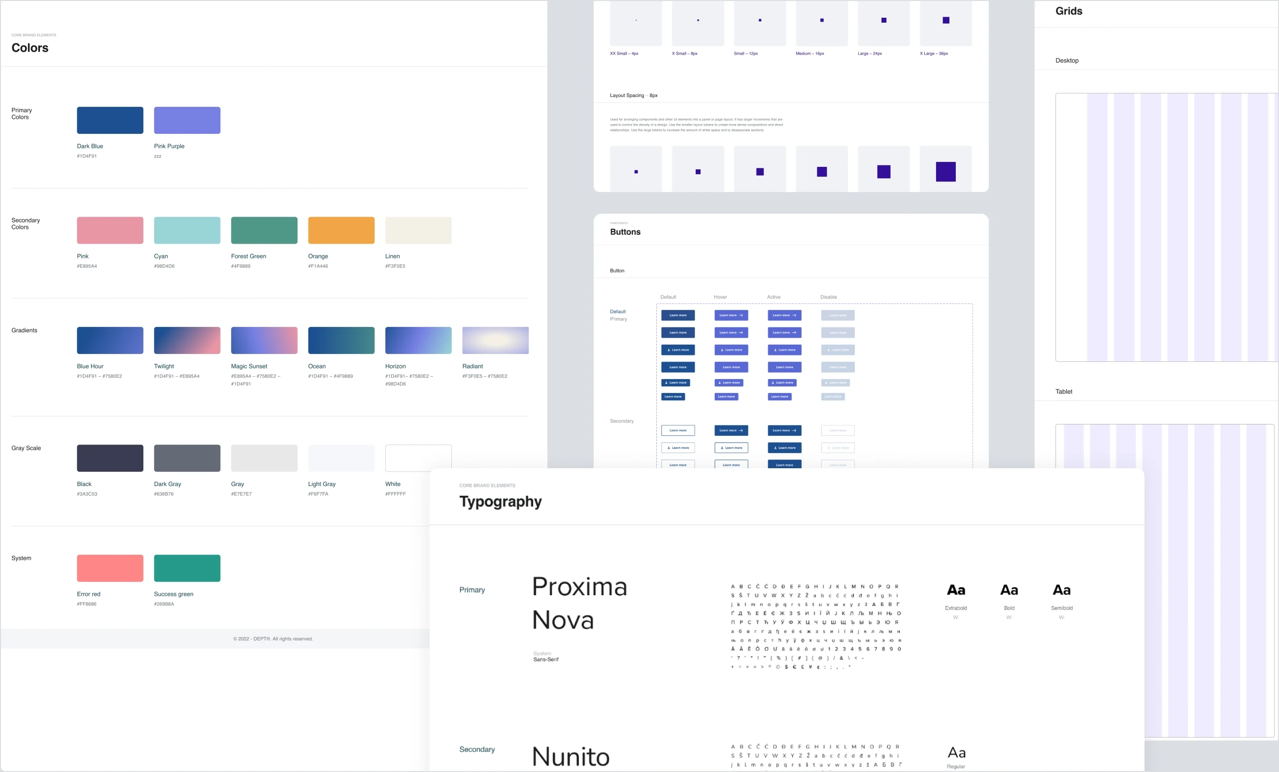
Design System Development
Our design system needed to support both global consistency and local relevance:
Modular components supporting different user journeys
Region-specific content variations
Mobile-first approach based on usage patterns
Cultural adaptation guidelines
The Solution
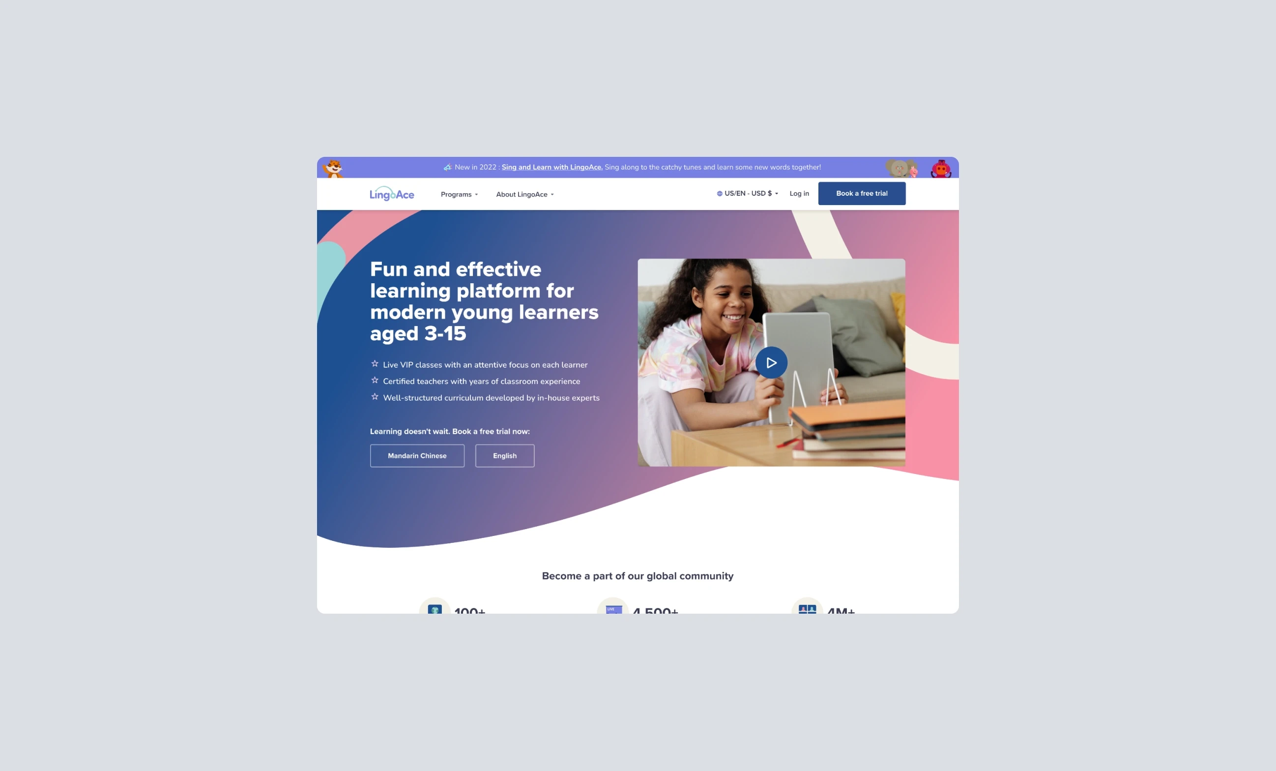
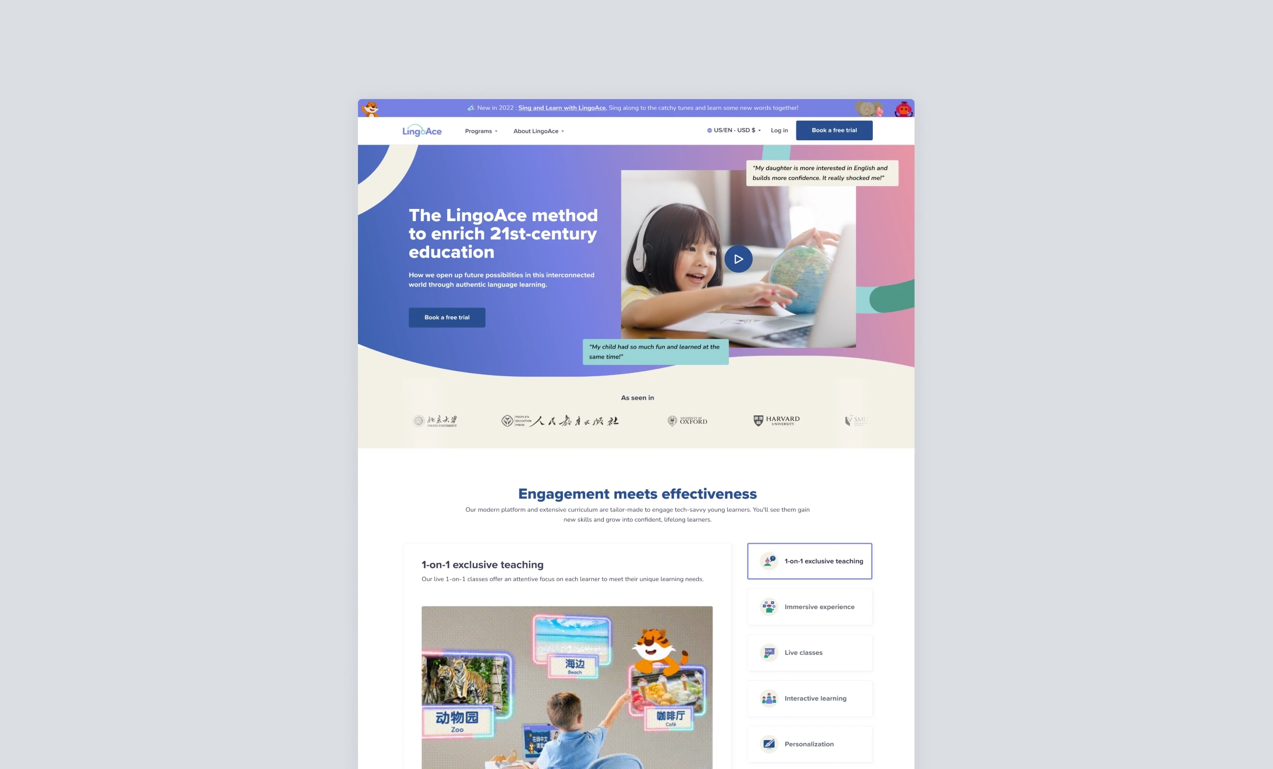
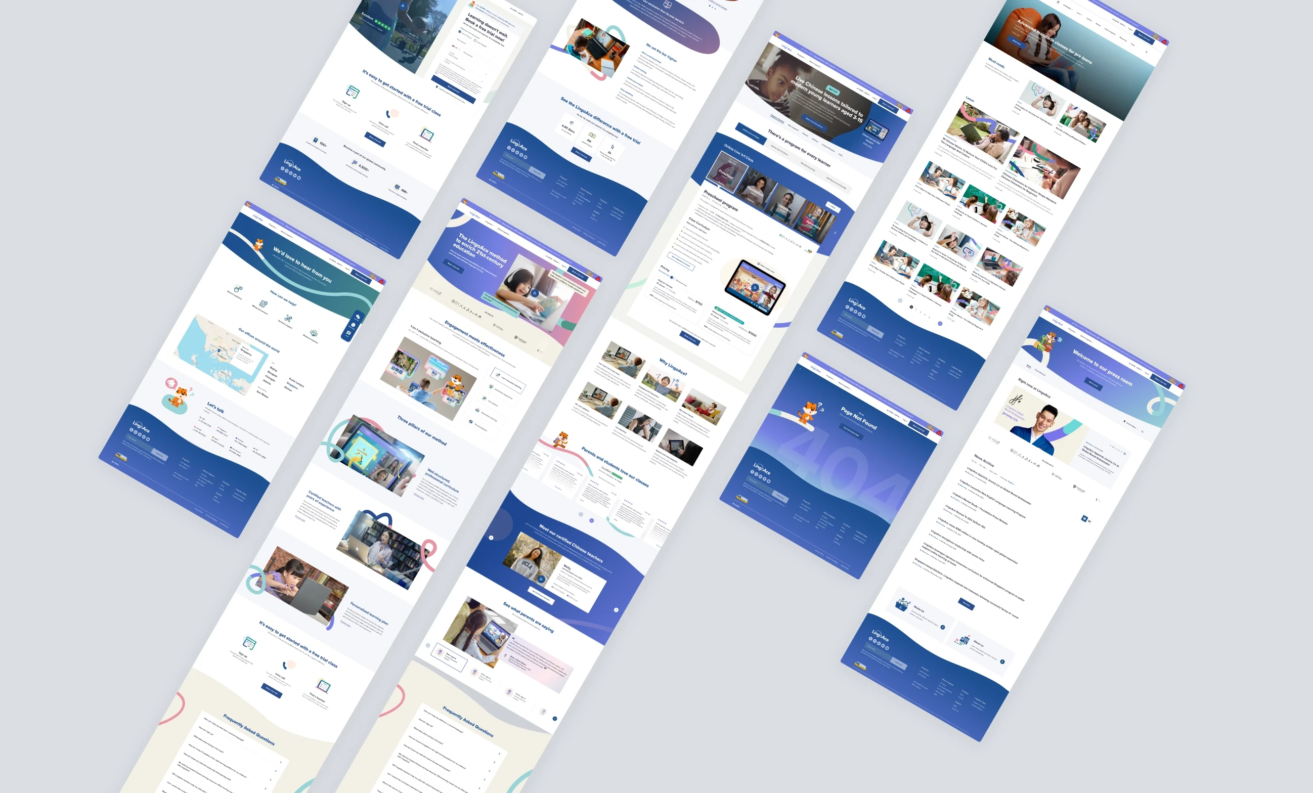
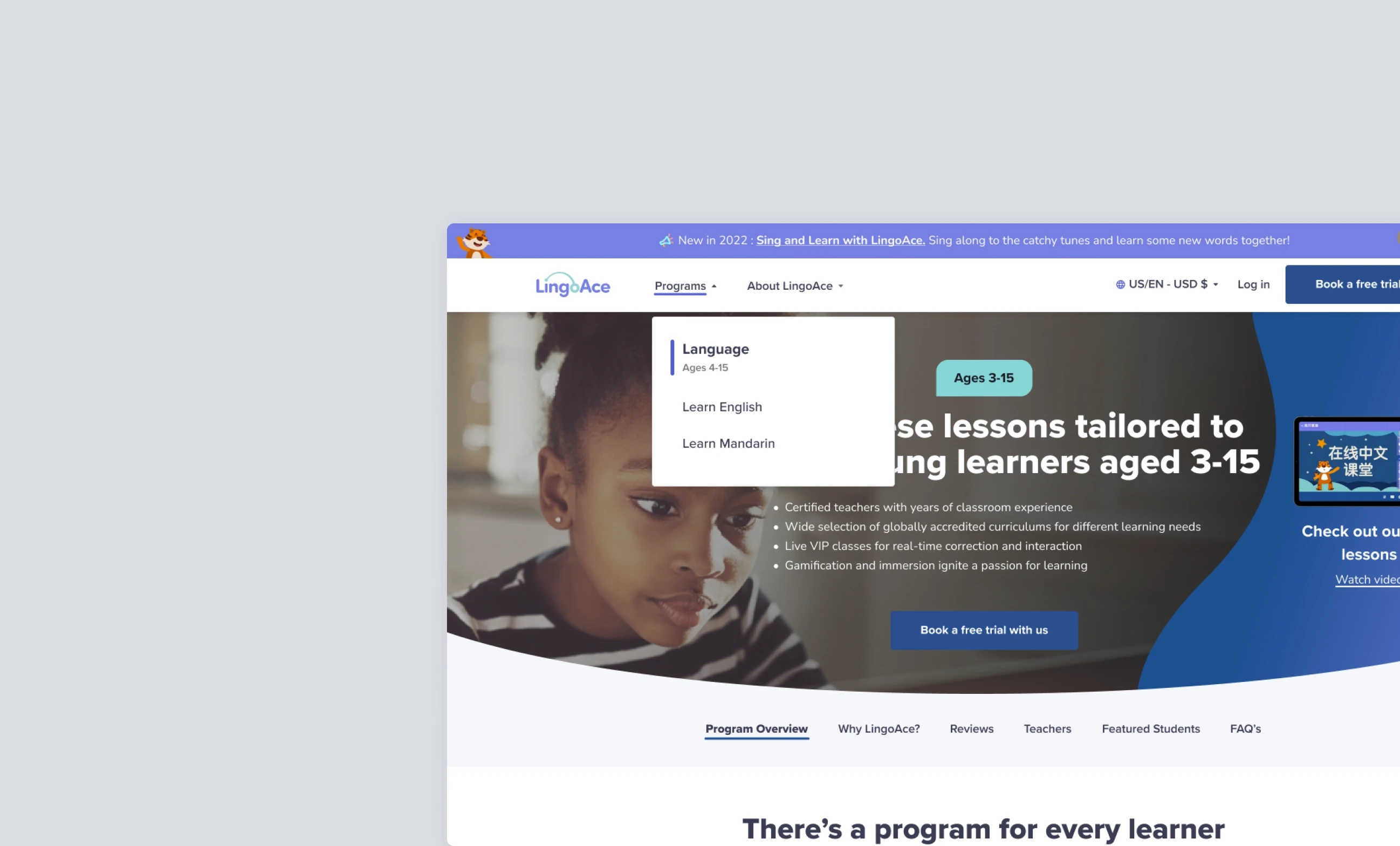
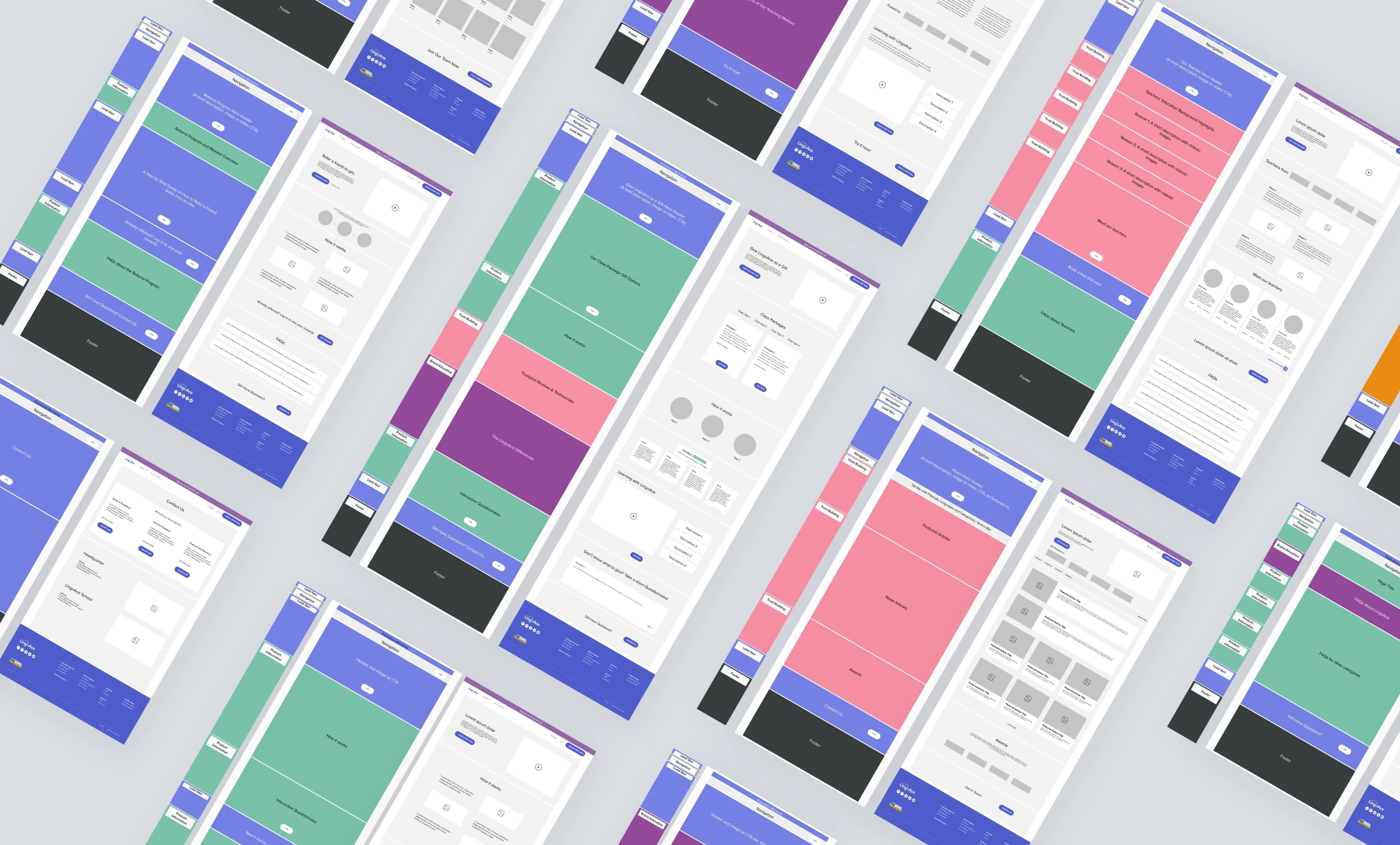
Armed with insights from our research and testing, we created a platform that could adapt to different user needs while maintaining a consistent brand experience. The final design transformed how parents discover and engage with LingoAce through several key features:
Content Discovery
Unified search across programs
Age-appropriate filtering
Region-specific recommendations
Clear program comparisons
Trust Building
Detailed teacher profiles and credentials
Transparent pricing structure
Interactive class previews
Social proof elements
User Experience
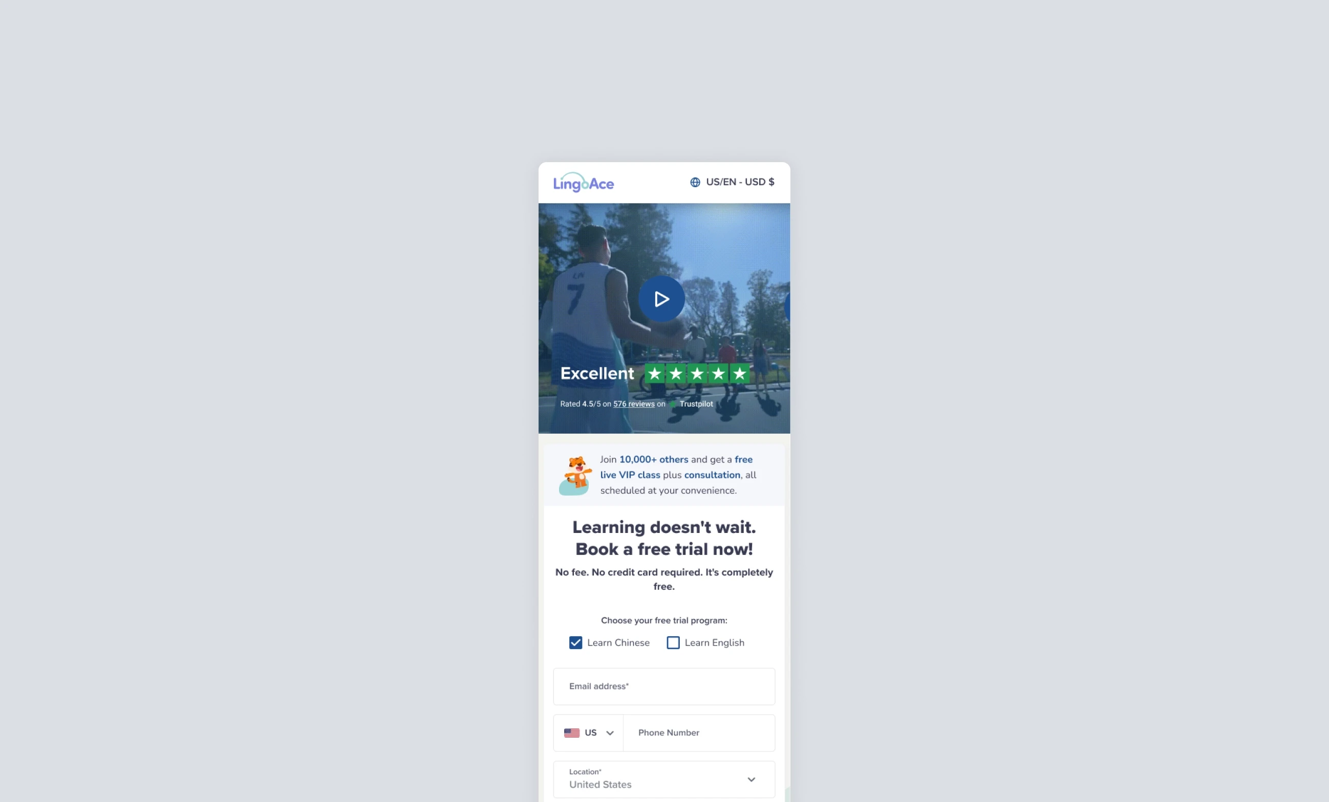
Flexible signup flows supporting both automated and high-touch paths
Clear trial class process
Progress tracking
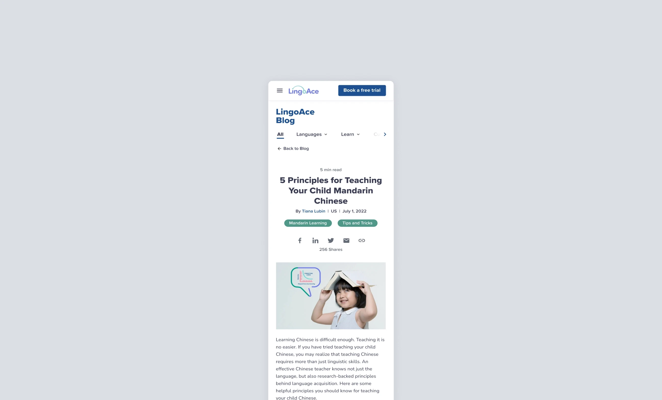
Mobile-optimized interfaces
Impact
The redesigned platform launched with impressive results:
48% increase in conversions within 10 days
85% increase in signup page traffic
32% improvement in conversion rates
62% increase in session time
More importantly, user testing validated our approach:
"It's certainly inviting as a parent... There's an intuitive flow to it and I couldn't see myself getting lost... I think it's a very clean website that would be very easy to navigate." — Usability Test Participant
Looking Forward
This project reinforced the importance of balancing global consistency with local relevance. By deeply understanding different user segments and their needs, we created a platform that could adapt to local markets while maintaining the core strengths that made LingoAce successful.

